Clinical trials play a pivotal role in advancing medical knowledge, evaluating the safety and efficacy of various medical products. However, achieving diversity among clinical trial participants remains a challenge, especially with underrepresentation of certain demographics like racial and ethnic minorities.
This gap is concerning as different population groups may react in unique ways to medical intervention. The US Food and Drug Administration (FDA) underscores the importance of diverse participation, emphasizing the need for clinical trial populations to reflect the demographics of potential product users. Encouraging diverse enrollment is not only essential for ethical reasons but also for ensuring the effectiveness and safety of medical interventions across diverse populations.
Geospatial data analysis to ensure data coherence and consistency can be crucial for the aforementioned reason. Not addressing data curation needs, like reconciling variations in location names, can impact the accuracy of mapping activities. Moreover, dealing with various levels of detail across datasets poses challenges when trying to integrate and analyze spatial information effectively.
Overcoming these obstacles requires careful data curation strategies and tools like Datacise®, which provide comprehensive visualization options and enable users to merge diverse datasets seamlessly. These types of platforms not only facilitate detailed spatial analysis but also empower decision-makers to make informed choices, especially in scenarios such as selecting optimal trial sites with diverse participant pools.
Working with Data Sources
A key step in working with a geospatial dashboard is being able to combine data from several sources into a coherent data set.
If data curation needs are not attended to, such as conforming location names, it is easy to throw any geospatial mapping activities off track. As data is pulled in, beware of site location name variations. Additionally, it is important to develop a strategy to identify variations and assign them to standardized names.

A good strategy is to set up a pipeline to accept, ingest, curate, and visualize the data, as shown in the above figure.
Working with Name Variations
When working with name variations it is vital to know how names can vary and how to handle them. When using global data, for instance, it then becomes even more troublesome as translations enter the picture.
Consider General Hospital. Of course, in English it is “General Hospital,” but a Spanish speaking operator may enter it into their native database as “Hospital General,” for instance. As various global sources come together, these types of variation have the potential to creep into the clinical trial data.
One way to overcome this is to set up a dictionary of sorts that lists each variation and the preferred term, as shown below.
|
Variation |
Preferred Term |
|---|---|
|
General Hospital |
General Hospital |
|
Hospital General |
General Hospital |
|
General Hosptal |
General Hospital |
|
Centro Hospitalario General |
General Hospital |
Typically, these variations are handled within the data curation phase. Ideally, this should be taken care of prior to moving data into the dashboards. At MMS, we use Datacise® to manage curation activities using classical and artificial intelligence (AI) methods.
Location and Granularity
When trying to pinpoint location, keep in mind how the data identifies its location. Consider the datasets in the following table. Each includes location data, yet it is tracked differently.
| Data Set | Location Indication | Granularity |
|---|---|---|
| Site Location | Point | Latitude and Longitude coordinates |
| Epidemiological Date | Geopolitical | State or County Level |
| Demographic | Geopolitical | Voting district or City |
As seen above, these three data sets have different means to identify the location. Point location means it is possible to pinpoint the location on a map. It is akin to marking the location with a pushpin. Geopolitical locations are described by boundaries. This may include city limits or county borders, for instance.
The issue often encountered when working with these data sets is that their granularity differs, causing challenges downstream when trying to collate the information on a map.
There are several ways to overcome this issue.
Leverage Data Curation
During data curation, try making the granularity of the source data the same. For instance, the epidemiological data is listed by county and demographic data by city. To ensure this is reported consistently, reduce the demographic data’s granularity to the county level. To do this, “roll-up” the demographic data to the county. To do this, other data sources may need to be introduced which can allow for mapping cities to counties.
Rely on built in Mapping Tool Features
The mapping tool may be able to paint various data correctly. For instance, show various rates of disease by count, by color areas with the county per demographics. The difficulty with the approach is it makes it hard to perform quantitative analysis. Though one can quickly see the data overlayed on a map, it is difficult to combine the data to perform meaningful side-by-side comparison and calculations.
How Datacise Works
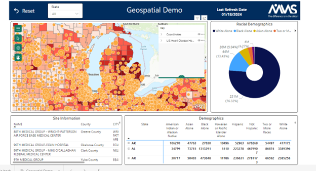
Datacise supports numerous visualization options, allowing users to drill into study data expediently and effectively. Geospatial visualization is the most customizable and powerful tool in the Datacise arsenal.
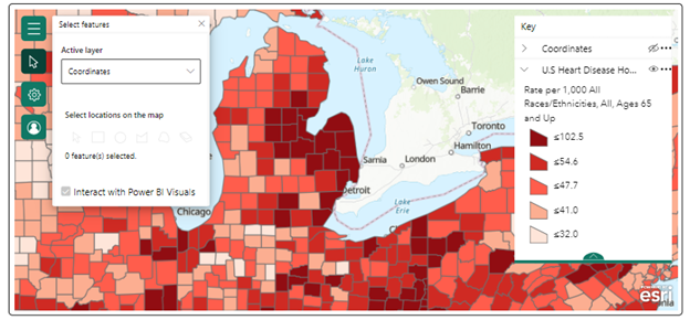
The geospatial visualization allows multiple layers to be displayed together on a map including race, disease prevalence, economic factors, age, gender, and many others in the US and other regions. These factors can be combined and overlayed with privately-owned data to allow a user to see the relevance of these variables as they pertain to the study data on hand.
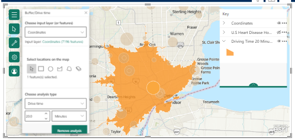
For instance, drive time between locations can be estimated and analyzed within the tool and how far one can travel in the area within a set time. A defined radius around a set location can also be set to analyze information around a selected site or general location. This allows for quick analysis of the characteristics of an area and what distance locations are from a selected site.
Furthermore, the geospatial visualization is compatible with other standard visualizations on the Datacise platform. Selections made on the geospatial visual will also transform the visualizations, counts, and tables present on the dashboard. Selections on the standard visualizations will likewise transform data contained within the geospatial visualization.
Scenario: Selecting the Right Site
The diversity of a clinical trial is a key factor in any study in modern medicine. The FDA has emphasized this importance by defining what a diverse trial should look like and enforcing these definitions on all trials.
That begs the question: How is diversity ensured in a clinical trial effectively and efficiently? This is where the Datacise geospatial dashboard becomes important as the location of a site can drastically affect the demographics of subjects enrolled in a clinical trial and their compliance after patient enrollment.

Imagine the following scenario: A study manager is tasked with selecting the sites to be used during a clinical trial. It is important that more than two-thirds (66%) of the trial are African American, as the disease of interest effects this group. Datacise will be able to overlay the locations of all sites on a map which includes information such as diversity index and population by race. This will allow the manager to quickly rule out sites that are not inclusive of the diverse enrollment requirements, leaving perhaps a few viable options.
Considering Drive Times
Once it is determined that the correct population exists in the general area of a site it is important to consider the drive time between the site and the surrounding area. Just distance alone might not be a sufficient predictor of transportation time.
Using Datacise, the manager can quickly map out all areas within a 20-minute drive of the site. Afterall, individuals may not enroll in a clinical trial if they are required to engage in long commutes or may have issues with compliance later in the trial. A predefined radius around a site can also help the manager determine what the population demographics are in the area directly surrounding the site.

Viewing Disease Prevalence
If disease prevalence is also important, that layer can be added to further assist in determining the best site. Furthermore, if it might be necessary to transport a sample from one location to another there may be volatility concerns. So, the site needs access to the required demographics and to be closely located to the laboratory performing the sample analysis.
Drive time and a general radius around this sample collection site would be imperative if the sample at hand is volatile. After accessing all these factors, a manager will be able to quickly determine which sites are the best candidates for their clinical trial.

Key Advantages
Most other tools, revolving around geospatial data, do not combine all the capabilities of the Datacise model. The Datacise tool allows for users to take their own data and then combine it to other data as a background. Multiple layers of data can be displayed at a single time with near limitless customization options including other visualizations, data filters, and tables.
This can all be accomplished in a matter of weeks; whereas other tools can take several months to develop.
The Datacise MMS team works directly with each sponsor to customize each dashboard to fit the needs of a study. Not all tools will offer this level of customization or any customization at all. Datacise is a browser-based tool that does not require specialized licensing to access which keeps the price low and allows ease of access. The only requirement to access Datacise dashboards is an internet connection and an internet browser.
For a demo of Datacise, please click here and we will connect you with the appropriate expert.
Authored by: Kris Wenzel, Senior Manager, Data Science


